
The Ultimate YouTube Advertising Guide
BY THE NUMBERS YouTube is one of the largest search engines, second only to its…

BY THE NUMBERS YouTube is one of the largest search engines, second only to its…
Purchasing advertising on third-party sites can be a challenge since there’s no guarantee your spend…

WE LIVE IN THE FUTURE. We have Dick Tracy-style watches, Star Trek-like voice-to-computer communication, hoverboards…
We have Dick Tracy-style watches, Star Trek-like voice-to-computer communication, hoverboards (OMG, SERIOUSLY!) and the world of information at our fingertips. This is the age of the Modern Web. And you know what? It can kiss my @$$.
I miss the early days, when the web was young, I still had black hair and Bill Clinton was busy not having “sexual relations with that woman.” Give me the web of 1998.
I know what you’re saying, “Surely you jest.” And I say, “Stop calling me Shirley.” But seriously, I’ve got like almost 10 solid reasons why the web was way better back then.
Let me set the stage. The year is 1998, Dawson’s Creek lands on The WB, Third Eye Blind’s “How’s It Going to Be” hits number 9 on the Billboard Hot 100, Ben Affleck and Bruce Willis save the world from Armageddon, and Google launches.
I know. It’s already pretty epic. But let’s get started…

Everyone these days is all hyped up on the responsive design Kool-Aid – adaptive display of content on different devices. Pffft. In the early days, we had one monitor size – 640×480. (Yes, the standard monitor resolution we targeted in 1998 was almost half the size of an iPhone 6.) And you know what, we squeezed all kinds of content into that little space and nobody said, “Oh, it’s so little, how am I supposed to read it? Wah wah wah. What if I have a bigger monitor? What does it look like on my watch? Blah blah blah.”
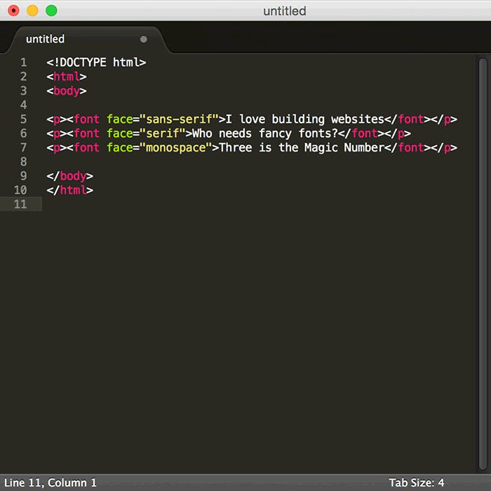
As the web grew and print designers started getting all whiny about typography when they began trying to design for the web, thousands of fonts became available for use online. But in 1998 we had three: Times, Arial and Courier on a PC; Georgia, Helvetica, Courier on a Mac. We didn’t need access to thousands of gorgeous fonts, in multiple weights, meticulously crafted to look amazing on-screen and breathe life into our designs. No, sir. Plus, we all know that limiting a client’s options is better for everyone involved. And, hey, if we wanted a nice font, we made an image out of it, because screw SEO. Speaking of SEO…
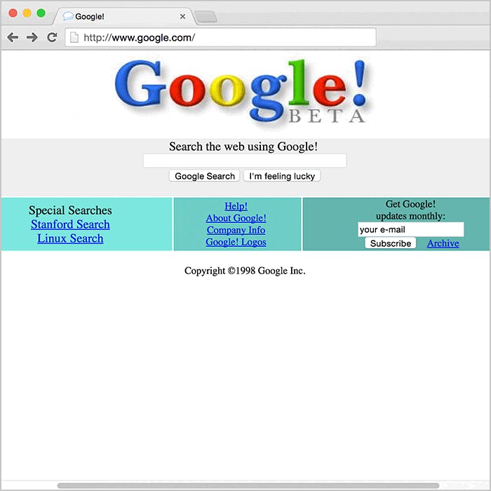
Like I mentioned earlier, Google only launched in 1998. And not even at the beginning of 1998. So we didn’t need things like alt tags or rich, meaningful, relevant content. We didn’t need meta descriptions or any of the mumbo jumbo. We designed a site, built it, threw it out there and prayed to god that people would somehow find it. Because back then, diving into the Internet was a bit like a game of pin the tail on the donkey… or Russian roulette depending on what you were looking for.

Are you kidding me?! 1) There wasn’t HD anything back then. 2) We were dealing with 56k dial-up. What videos did exist online reminded you of trying to watch scrambled porn back in the 80s… which, let’s be honest, was probably what we were looking for online too. But I digress. You wanted to add interesting, engaging content in video form? Too bad. Now, if you wanted to add interesting, engaging content in the form of animation… that was a different story.

Dear Lord, I can already hear the collective “Ugh” from everyone out there. But you know what? Flash. Was. King. There was nothing, and I mean nothing, that said, “This is going to be an awesome website” more than an animated intro using business stock photos and buzzword text, all flying around your screen to the tune of a yet-to-make-it-to-the-states techno song. Also, banner ads. Who didn’t love an animated banner ad?
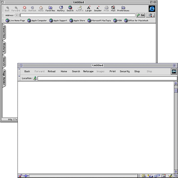
We didn’t have to worry about IE6-11, Edge, Safari (desktop and mobile), Chrome (desktop and mobile) and whatever the hell else is out there. Just two: IE4 and Netscape Navigator. There was of course AOL, but seriously, GET WITH THE TIMES, DAD!
Sorry about that.
And we didn’t even really browser test. Because everything was in tables, and tables were fairly predictable unlike CSS. Also…
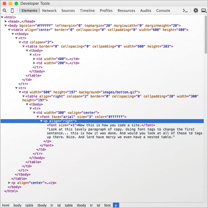
Like I said, we built everything in tables. There was no CSS layout in ’98. No box model hack, no bootstrap frameworks, no pre-processors, no easy way to simply adjust type and layout from a single location. Just you, a table, some font tags, and find and replace. And we loved it.
And there you go, 10 – hey, 7 is close to 10 – reasons why the wild wooly web of 1998 totally kicks the modern @$$ of the web of 2015. Now if you’ll excuse me, I’m going to go draw a bath, turn on some Savage Garden and wait for Friendsto come back on.